Mastering Web Typography: A Comprehensive Guide
Typography is far more than choosing a pretty font — it is the voice of your digital interface. In a world where 90% of web content is text, typography shapes how users perceive your brand, how easily they absorb information, and how long they stay engaged. Mastering web typography means balancing aesthetic beauty with technical precision and accessibility.
The Foundation: Serif vs. Sans Serif
At the heart of typography lie two primary classifications that set the tone for your entire design.
Serif Fonts: The Classic Authority

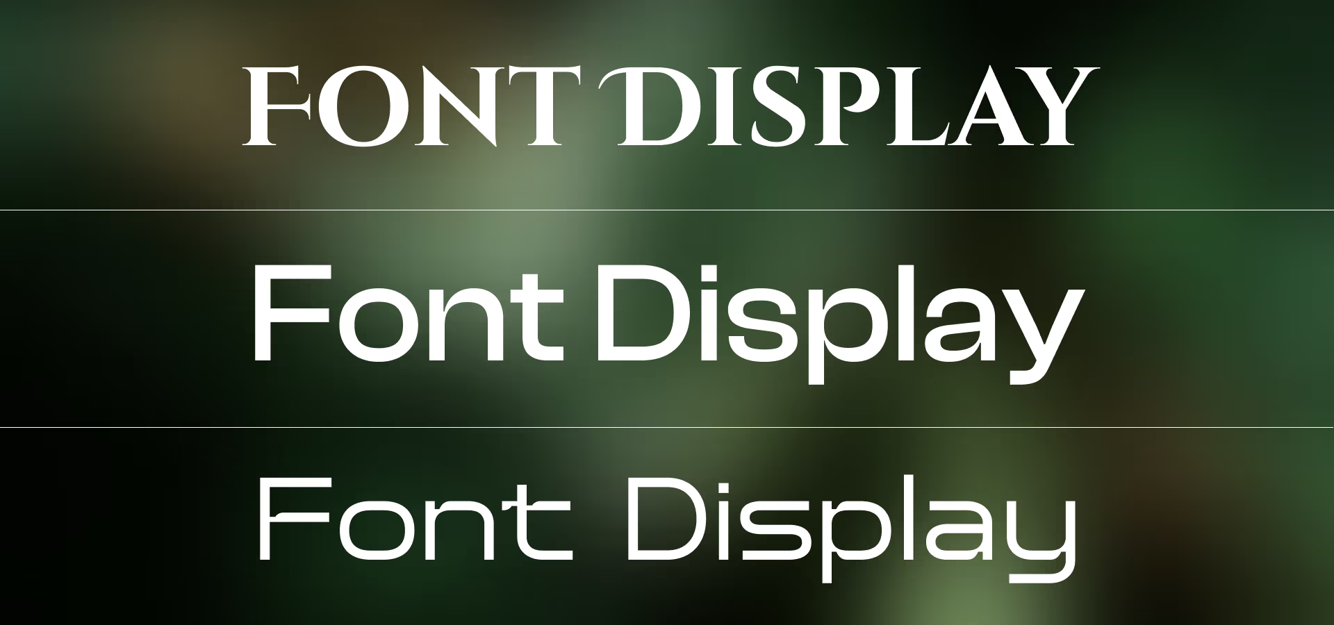
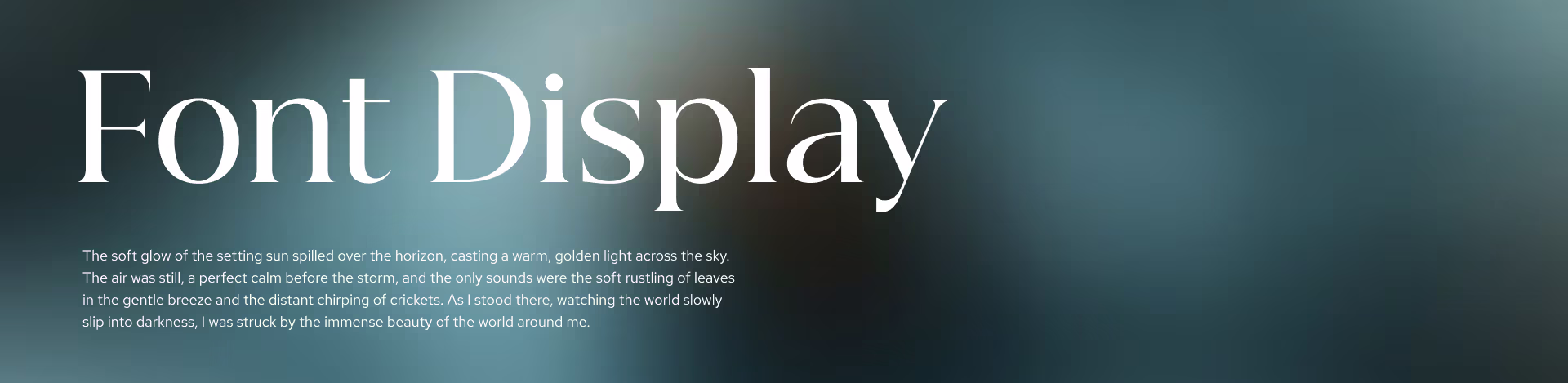
Serif fonts are defined by the small decorative lines, or "feet," at the ends of their strokes. They evoke tradition, reliability, and sophistication. Historically favored for print, modern serifs like Playfair Display and Lora are widely used in digital editorial design to convey a premium, authoritative feel.
Sans Serif Fonts: The Modern Minimalist

Sans serif fonts (from the French sans, meaning "without") omit those decorative strokes. They are the backbone of modern web design, offering a clean, neutral, and highly legible experience on digital screens. Fonts like Inter, Poppins, and Roboto are celebrated for their clarity and versatility across devices and screen sizes.
Beyond the Basics: Display, Script, and Monospace
While serif and sans serif do the heavy lifting, specialty fonts add character and functional precision to a design.
Display Fonts
Designed for large sizes, display fonts carry high personality. Use them for bold headings to make a statement, but never for body text — they sacrifice legibility at smaller sizes.
Script Fonts
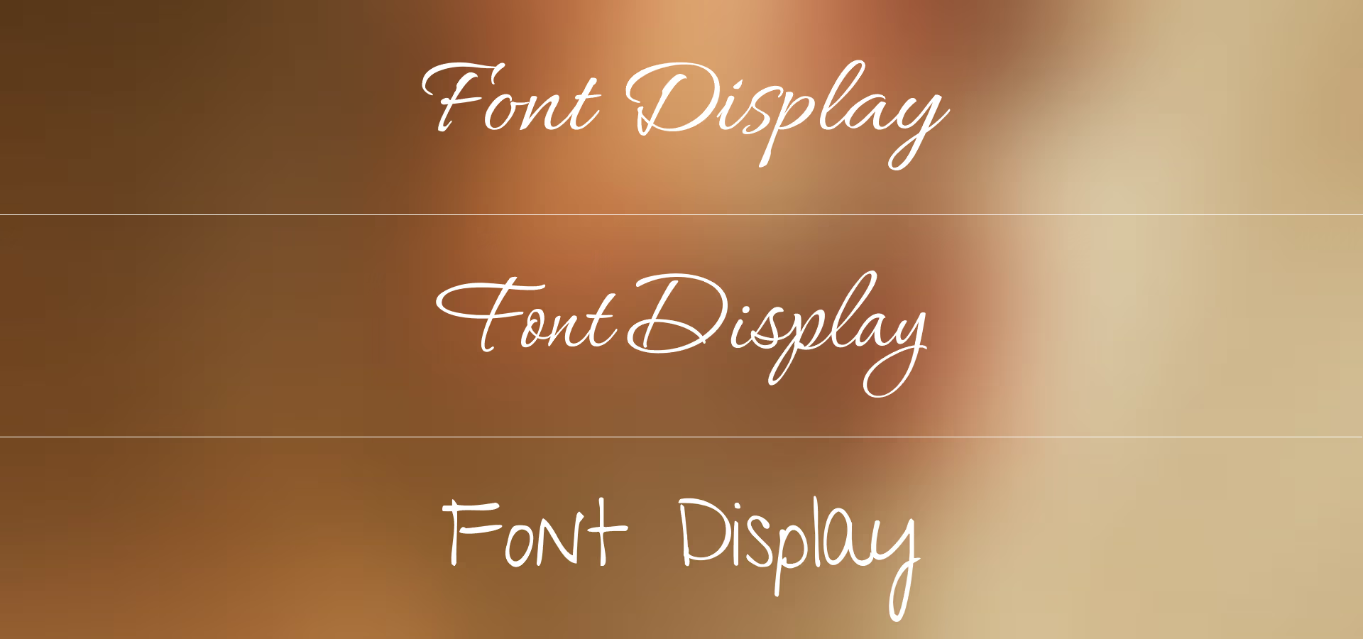
Script fonts mimic handwriting and add a human, elegant touch. Use them sparingly — as accents or decorative elements — rather than for extended reading.
Monospace Fonts
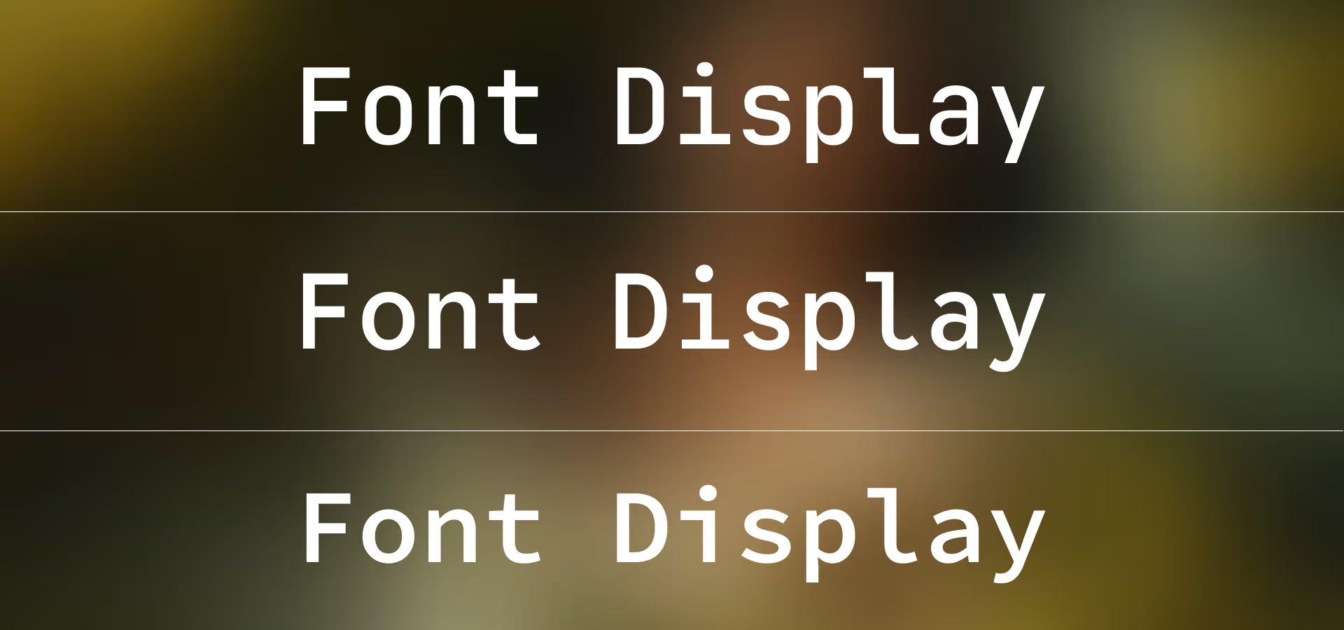
In a monospace typeface, every character occupies the same horizontal space. These are essential for code blocks, technical data displays, and achieving a clean engineering aesthetic.
The Art of Font Pairing
The secret to a compelling design lies in contrast. A common and effective pattern is pairing a high-contrast serif header with a clean sans serif body. This creates a clear visual hierarchy, making it easy for the reader's eye to distinguish between different levels of content.
Pro tip: When pairing fonts, ensure both share a similar x-height (the height of lowercase letters) to maintain a cohesive horizontal rhythm.
The Anatomy of Type: Understanding the Invisible Lines
To truly master typography, you must understand the structural framework that governs how letters sit and flow. These invisible lines are the DNA of every typeface.
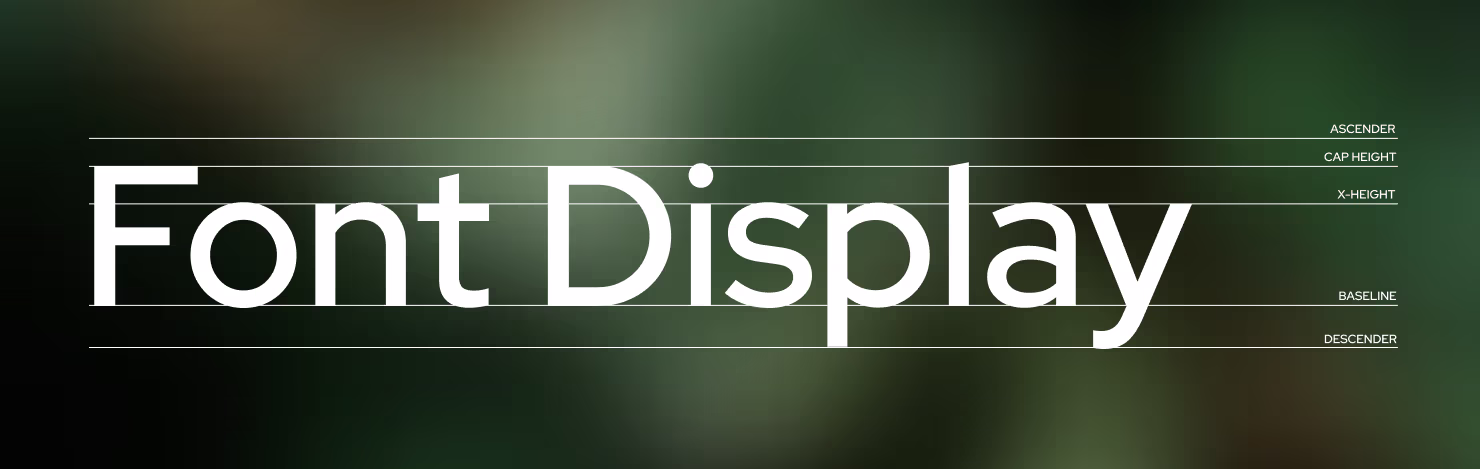
1. Ascender
The ascender is the part of a lowercase letter that extends above the x-height — seen in characters like b, d, f, h, k, and l. Well-defined ascenders help the eye distinguish between letters quickly.
2. Cap Height
The cap height is the distance from the baseline to the top of uppercase letters. It defines the vertical visual weight of your headings and capitalized text.
3. X-Height
The x-height refers to the height of lowercase letters (specifically the letter "x") within a typeface. Fonts with a larger x-height tend to be more legible at small sizes, while those with a smaller x-height feel more elegant and airy.
4. Baseline
The baseline is the invisible line upon which the majority of characters sit. It is the horizontal anchor that keeps text looking organized and readable.
5. Descender
The descender is the portion of a letter that drops below the baseline — found in characters like g, j, p, q, and y. Proper line spacing (leading) is essential to prevent descenders from colliding with the ascenders of the line below.
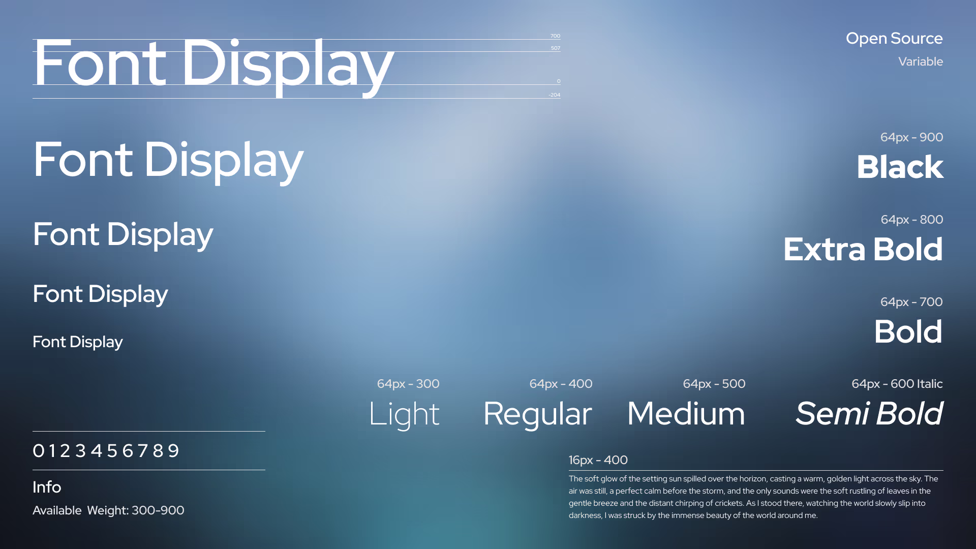
Technical Excellence: Fluid Typography and Accessibility
In 2026, responsive typography has evolved beyond simple breakpoints. We now use fluid typography to ensure text scales seamlessly across all screen sizes.
/* ============================================================
   FONT LOADING
   ============================================================
   @font-face registers a custom font for use in CSS.

   - font-family:   The name you'll reference in font-family rules.
   - font-style:    "normal" covers regular (non-italic) variants.
   - font-weight:   A range (300–900) registers a single variable
                    font file instead of one file per weight.
   - font-display:  "swap" renders a fallback font immediately,
                    then swaps in the custom font when ready —
                    preventing invisible text (FOIT).
   - src format:    woff2 is the standard format for the web. It
                    offers the highest compression and is supported
                    by all modern browsers.
   ============================================================ */

@font-face {
    font-family: 'Font Name';
    font-style: normal;
    font-weight: 300 900;
    font-display: swap;
    src: url('Font_Name.woff2') format('woff2');
}


/* ============================================================
   TYPE SCALE — CSS CUSTOM PROPERTIES
   ============================================================
   Centralising scale values as variables makes the entire type
   system easy to override at any scope (e.g., a component that
   needs a denser typographic rhythm can set --t-scale: 0.85).

   The scale below follows a ~1.25 "Major Third" modular ratio,
   which produces clear hierarchy without excessive size jumps.

     Step  | Token          | Approx. value (desktop)
     -------+----------------+------------------------
     0 (p)  | --t-step-0     | ~1.1 rem  (≈ 17–18 px)
     1      | --t-step-1     | ~1.375 rem (h6)
     2      | --t-step-2     | ~1.875 rem (h5)
     3      | --t-step-3     | ~2.5 rem   (h4)
     4      | --t-step-4     | ~3 rem     (h3)
     5      | --t-step-5     | ~3.625 rem (h2)
     6      | --t-step-6     | ~4.125 rem (h1)
   ============================================================ */

:root {
    --t-scale: 1;          /* global multiplier — override per component */

    /* Fluid clamp values: clamp(min, preferred, max)
       The preferred value is viewport-relative, growing with screen width. */
    --t-step-0: clamp(0.9rem,  0.9rem + 0.3vw,  1.1rem);
    --t-step-1: clamp(1rem,    1rem   + 0.3vw,  1.375rem);
    --t-step-2: clamp(1.1rem,  1.1rem + 0.6vw,  1.875rem);
    --t-step-3: clamp(1.2rem,  1.2rem + 0.9vw,  2.5rem);
    --t-step-4: clamp(1.3rem,  1.3rem + 1.2vw,  3rem);
    --t-step-5: clamp(1.4rem,  1.4rem + 1.5vw,  3.625rem);
    --t-step-6: clamp(1.5rem,  1.5rem + 1.8vw,  4.125rem);

    /* Heading tokens */
    --heading-font-weight:  500;
    --heading-line-height:  1.2;
    --heading-color:        inherit;

    /* Letter-spacing tokens for headings.
       Large display text benefits from slightly tighter tracking
       (negative values) — tight spacing feels intentional at big sizes.
       Smaller headings use looser tracking for legibility. */
    --heading-letter-spacing-xl: -0.03em;  /* h1, h2 — large display   */
    --heading-letter-spacing-md: -0.01em;  /* h3, h4 — medium headings */
    --heading-letter-spacing-sm:  0.01em;  /* h5, h6 — small headings  */

    /* Paragraph tokens */
    --paragraph-font-weight: 400;
    --paragraph-line-height: 1.6;
    --paragraph-color:       inherit;
}


/* ============================================================
   SHARED RESET FOR ALL TEXT ELEMENTS
   ============================================================
   Targeting both semantic tags (h1–h6, p) and utility classes
   (.h1–.h6, .p) lets you apply heading styles to any element
   without altering the DOM — useful for SEO or when you need
   an h2 that visually resembles an h4.

   --_t_scale is a private (scoped) custom property that
   inherits --t-scale from :root, or can be locally overridden.
   ============================================================ */

p, .p,
h6, h5, h4, h3, h2, h1,
.h6, .h5, .h4, .h3, .h2, .h1 {
    --_t_scale: var(--t-scale, 1); /* local alias for the scale multiplier */
    margin-block: 0;               /* remove default browser margins       */

    /* Add spacing after every element EXCEPT the last or only child,
       preventing a trailing gap at the end of a container. */
    &:not(:last-child, :only-child) {
        margin-block-end: 0.5rem;
    }

    /* .base — strips all margin and collapses line-height to 1.
       Useful inside flex/grid layouts where spacing is handled externally. */
    &.base {
        margin: 0;
        line-height: 1;
    }

    /* .bl — text-wrap: balance distributes words evenly across lines.
       Ideal for headings and short UI strings. Avoid on long paragraphs
       (the browser only applies it to text up to ~6 lines). */
    &.bl {
        text-wrap-style: balance;
    }

    /* .pr — text-wrap: pretty prevents orphans (a single word on the
       last line). The browser uses multi-line look-ahead, making it
       slightly slower than balance but better suited for body text. */
    &.pr {
        text-wrap-style: pretty;
    }

    /* .ca — text-box trims invisible leading above and below glyphs
       using the cap-height and alphabetic baseline. Use this when
       text needs to sit flush inside a button or card. */
    &.ca {
        text-box: trim-both cap alphabetic;
    }

    /* .ct — same as .ca, but trims to the text baseline instead.
       Useful for aligning icons next to text. */
    &.ct {
        text-box: trim-both cap text;
    }
}


/* ============================================================
   HEADING BASE STYLES
   ============================================================
   Applied to all heading levels. Individual levels below
   override font-size and letter-spacing as needed.
   ============================================================ */

h1, h2, h3, h4, h5, h6,
.h1, .h2, .h3, .h4, .h5, .h6 {
    font-weight:     var(--heading-font-weight, 500);
    line-height:     var(--heading-line-height,  1.2);
    color:           var(--heading-color);
    text-wrap-style: balance; /* headings are typically short — balance suits them */
}


/* ============================================================
   H1 — Display / Hero
   ============================================================
   The largest heading. Used once per page as the primary title.
   Tight negative tracking (-0.03em) is standard at display sizes;
   default letter-spacing looks too loose at 4 rem+.
   ============================================================ */

h1, .h1 {
    font-size:      calc(var(--t-step-6) * var(--_t_scale));
    letter-spacing: var(--heading-letter-spacing-xl, -0.03em);
}

/* H2 — Section Title */
h2, .h2 {
    font-size:      calc(var(--t-step-5) * var(--_t_scale));
    letter-spacing: var(--heading-letter-spacing-xl, -0.03em);
}

/* H3 — Sub-section Title */
h3, .h3 {
    font-size:      calc(var(--t-step-4) * var(--_t_scale));
    letter-spacing: var(--heading-letter-spacing-md, -0.01em);
}

/* H4 — Card / Block Title */
h4, .h4 {
    font-size:      calc(var(--t-step-3) * var(--_t_scale));
    letter-spacing: var(--heading-letter-spacing-md, -0.01em);
}

/* H5 — Label / Caption Heading */
h5, .h5 {
    font-size:      calc(var(--t-step-2) * var(--_t_scale));
    letter-spacing: var(--heading-letter-spacing-sm, 0.01em);
}

/* H6 — Smallest Heading */
h6, .h6 {
    font-size:      calc(var(--t-step-1) * var(--_t_scale));
    letter-spacing: var(--heading-letter-spacing-sm, 0.01em);
}


/* ============================================================
   PARAGRAPH
   ============================================================
   Body text uses --t-step-0 — the baseline of the type scale.
   font-weight: 400 (Regular) is recommended for long-form reading;
   500 may be used for UI labels or short descriptions.

   line-height: 1.6 falls within the WCAG-recommended 1.5–2.0
   range, providing comfortable reading without excessive whitespace.

   text-wrap: pretty prevents orphaned last words without the
   performance cost of balance on multi-paragraph content.
   ============================================================ */

p, .p {
    font-size:       calc(var(--t-step-0) * var(--_t_scale));
    font-weight:     var(--paragraph-font-weight, 400);
    line-height:     var(--paragraph-line-height, 1.6);
    color:           var(--paragraph-color);
    text-wrap-style: pretty;
}
The Case for Self-Hosting
While services like Google Fonts are convenient, self-hosting your font files using the @font-face method above is the professional standard for high-performance websites.
1. Superior Performance
Self-hosting eliminates the need for a separate DNS lookup and a new connection to a third-party server. By serving fonts from the same origin as your site, you can leverage HTTP/2 or HTTP/3 multiplexing, allowing the font to load in parallel with your other assets.
2. Privacy & GDPR Compliance
Third-party font providers often log user IP addresses for analytics. Self-hosting ensures that no user data is shared with external parties, making it the safest choice for privacy-conscious brands and GDPR compliance.
3. Absolute Reliability
When you depend on an external CDN, you are at the mercy of its uptime and any changes made to its library. Self-hosting gives you complete control — as long as your site is online, your typography will render correctly.
4. Advanced Caching Control
Hosting fonts yourself allows you to define your own Cache-Control headers, instructing the browser to store font files locally for an extended period (up to a year). Returning visitors will then experience near-instant load times.
Accessibility: The Non-Negotiable Rules
Good typography is also accessible typography. Follow these fundamentals to ensure your text is readable by all users.
- Body text size: Never go below 16px. For long-form content, 18px or 20px is often preferred.
- Line height: Aim for a line-height between 1.5 and 1.7 for body text to prevent lines from feeling cramped or crowded.
- Color contrast: Ensure your text-to-background contrast ratio meets WCAG AA standards — a minimum ratio of 4.5:1.
Conclusion
Great typography is invisible. It guides the reader effortlessly through content, making the experience feel natural and intuitive. By respecting hierarchy, prioritizing legibility, and embracing modern tools like variable fonts and fluid type scales, you can elevate your web design from standard to truly premium.