Parallax Image
This is parallax image component that use CSS view timeline to create a parallax effect.
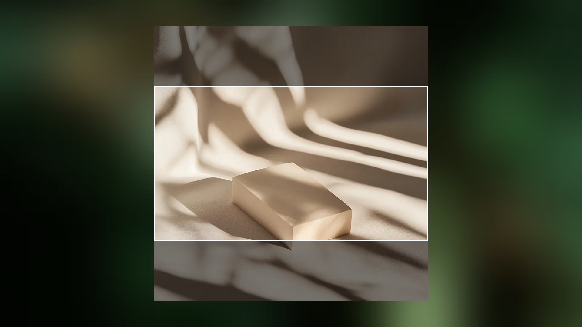
Overview
This is component commonly used in awwward winning website. It is a very simple and lightweight component that can be used to create a parallax effect on images.
GPU Accelerated: Leverages CSS
translateandview-timelinefor buttery-smooth 60fps performance.Pure CSS: Zero JavaScript required for the core parallax effect, reducing bundle size and execution overhead.
Highly Versatile: Supports both vertical and horizontal (inline) scroll orientations with a single component.
Technical Specifications
| Parameter | Value |
|---|---|
| Logic | CSS View Timeline |
| Styling | Vanilla CSS (Nested) |
| APIs | view(), translate |
| Payload | < 1KB (Pure CSS) |
Implementation
1. Structural CSS
.parallax-img-wrapper {
    display: grid;
    height: 100%;
    overflow: clip;

    .parallax-img {
        --extend: 35%;
        --extend-x: 0px;
        --extend-y: var(--extend);
        --translate-x: calc(-1 * (var(--extend-x, 0) / (100% + var(--extend-x, 0)) * 100%));
        --translate-y: calc(-1 * (var(--extend-y, 0) / (100% + var(--extend-y, 0)) * 100%));
        display: block;
        width: calc(100% + var(--extend-x, 0));
        height: calc(100% + var(--extend-y, 0));
        object-fit: cover;
        object-position: center;
        animation: moveImg linear both;
        animation-timeline: view();

        .inline > & {
            --extend-y: 0px;
            --extend-x: var(--extend);
            animation-timeline: view(inline);
        }
    }
}

@keyframes moveImg {
    to {
        translate: var(--translate-x) var(--translate-y);
    }
}
<div class="parallax-img-wrapper">
    <img class="parallax-img" src="img.png" alt="">
</div>
Vertical Scroll Example
.vertical__scroll {
    height: calc(200vh + 100vw);
    overflow: clip;
    view-timeline: --ver-scroll;

    .wrapper {
        position: sticky;
        inset: 0 0 auto;
        display: flex;
        gap: calc(1.5vw + 1.5vh);
        padding-inline: 5%;
        padding-block: 12.5vh;
        height: 100vh;
        animation: _moveSec linear both;
        animation-timeline: --ver-scroll;
        animation-range: contain;

        .parallax-img-wrapper {
            flex-shrink: 0;
            width: 100%;

            .parallax-img {
                animation-timeline: --ver-scroll;
                animation-range: contain;
            }
        }
    }
}

@keyframes _moveSec {
    to {
        translate: calc(-90% - 95vw) 0;
    }
}

@supports not (animation-timeline: view()) {
    .vertical__scroll {
        height: auto;
        .wrapper {
            animation: none;
            overflow: auto;
        }
    }

    .parallax-img-wrapper .parallax-img {
        animation: none !important;
    }
}
<section class="vertical__scroll">
    <div class="wrapper">
        <div class="parallax-img-wrapper inline">
            <img class="parallax-img" src="img-1.webp" alt="">
        </div>
        <div class="parallax-img-wrapper inline">
            <img class="parallax-img" src="img-2.webp" alt="">
        </div>
    </div>
</section>
Integration
- Add CSS Styles: Copy the structural CSS into your project's main stylesheet.
- Markup: Wrap your image in a
.parallax-img-wrappercontainer and apply the.parallax-imgclass to the image itself. - Adjust Intensity: Use the
--extendCSS variable to control how much the image overflows and moves relative to the scroll. - Horizontal Scroll: For horizontal sections, add the
.inlineclass to the wrapper.