Carousel
A high-performance, future-ready carousel component leveraging CSS Scroll Snap 2 for native-feeling interactions with minimal overhead.
Overview
The Carousel component solves the trade-off between performance and features by prioritizing native browser capabilities. By utilizing the latest CSS Scroll Snap specifications—specifically scroll-marker-group and scroll-button—it delivers a smooth, hardware-accelerated experience. A lightweight JavaScript polyfill handles backward compatibility, ensuring that all users receive a consistent and accessible interface.
Key Features
- Native Power: Leverages CSS Scroll Snap 2 for smooth, declarative scroll behavior.
- Progressive Enhancement: Zero-JS core for modern browsers with an intelligent, small-footprint polyfill for others.
- Performance: High-performance, zero-bloat logic.
Technical Specifications
| Parameter | Value |
|---|---|
| Logic | CSS Scroll Snap 2 + JS Polyfill |
| Styling | Vanilla CSS (Modern Nesting) |
| APIs | CSS @supports, Scroll Snap 2 |
| Payload | < 2KB (CSS + JS) |
Implementation
1. Structural CSS
/* Polyfill for Safari and Firefox */
@import './polyfill.css' supports(not (scroll-marker-group: after));

carousel, .carousel {
    --min-height: 300px;
    --offset: .75rem;
    --indicator-bg: #fff;
    --button-bg: rgb(0 0 0 / .3);
    --button-gap: 1rem;
    --button-size: 3rem;
    --button-color: #fff;

    display: grid;
    gap: 1rem;
    position: relative;

    .scroller {
        display: flex;
        min-height: var(--min-height);
        gap: var(--gap);
        overflow: auto;
        padding-inline: var(--edge-offset-x);
        scrollbar-width: none;
        scroll-snap-type: x mandatory;
        scroll-behavior: smooth;
        scroll-marker-group: after;
        cursor: grab;
        will-change: scroll-position;

        [controls] & {
            &::scroll-button(left) {
                content: "⟨"/ "Previous";
            }

            &::scroll-button(right) {
                content: "⟩"/ "Next";
            }
        }

        .item {
            flex-shrink: 0;
            width: 100%;
            user-select: none;
            -webkit-user-drag: none;
            scroll-snap-align: center;

            &.auto {
                width: auto;
            }

            [snap~=left] & {
                scroll-snap-align: start;
            }

            [snap~=right] & {
                scroll-snap-align: end;
            }

            [snap~=none] & {
                scroll-snap-align: none;
            }

            &::scroll-marker {
                content: '';
            }
        }

    }

    &[indicators] {
        ::scroll-marker-group {
            display: flex;
            min-height: calc(var(--indicator-height, .2rem) + 2rem);
            max-width: calc(100% - var(--edge-offset-x, 0) * 2);
            overflow-x: auto;
            scrollbar-width: none;
            gap: 1rem;
            display: flex;
            gap: var(--indicator-gap, .5rem);
            margin-inline: var(--edge-offset-x, 0);
            justify-content: center;
            pointer-events: none;
        }

        &:not([indicators~=top], [indicators~=bottom]) {
            ::scroll-marker-group {
                position: absolute;
                inset: auto 0 0;
            }
        }

        &[indicators~=top] {
            ::scroll-marker-group {
                grid-column: 1 / 2;
                grid-row: 1 / 2;
                align-self: end;
                margin-bottom: -1rem;
            }
        }

        &[indicators~=bottom] {
            ::scroll-marker-group {
                grid-column: 1 / 2;
                grid-row: 2 / 3;
                margin-top: -1rem;
            }
        }

        &[indicators~=right] {
            ::scroll-marker-group {
                justify-content: end;
            }
        }

        &[indicators~=left] {
            ::scroll-marker-group {
                justify-content: start;
            }
        }

        ::scroll-marker {
            padding: 0;
            height: var(--indicator-height, .2rem);
            width: var(--indicator-width, 1.5rem);
            box-sizing: content-box;
            border-block: 1rem solid transparent;
            border-radius: 0;
            pointer-events: auto;
            flex-shrink: 0;
            opacity: .5;
            background: var(--indicator-bg);
            background-clip: padding-box;
            transition: .3s;
        }

        ::scroll-marker:target-current {
            width: var(--indicator-active-width, 2.5rem);
            opacity: 1;
        }
    }

    &[controls] {
        ::scroll-button(*) {
            display: grid;
            place-content: center;
            height: var(--button-size);
            width: var(--button-size);
            font-size: 1rem;
            border: 0;
            border-radius: 0;
            background: var(--button-bg);
            color: var(--button-color);
            cursor: pointer;
            z-index: 2;
        }

        ::scroll-button(*):disabled {
            cursor: not-allowed;
            opacity: .5;
        }

        &:not([controls~=top], [controls~=bottom]) {
            ::scroll-button(*) {
                position: absolute;
                top: 50%;
                translate: 0 -50%;
            }

            ::scroll-button(left) {
                left: max(calc(var(--edge-offset-x) / 4), var(--offset, .5rem));
            }

            ::scroll-button(right) {
                right: max(calc(var(--edge-offset-x) / 4), var(--offset, .5rem));
            }
        }

        &[controls~=top], &[controls~=bottom] {
            ::scroll-button(*) {
                grid-column: 1 / 2;
                margin-inline: var(--edge-offset-x);
                justify-self: end;
            }

            ::scroll-button(left) {
                translate: calc(-100% - var(--button-gap, 0)) 0;
            }

            &[controls~=left] {
                ::scroll-button(*) {
                    justify-self: start;
                }

                ::scroll-button(left) {
                    translate: 0 0;
                }

                ::scroll-button(right) {
                    translate: calc(100% + var(--button-gap, 0)) 0;
                }
            }

            &[controls~=center] {
                ::scroll-button(*) {
                    justify-self: center;
                }

                ::scroll-button(left) {
                    translate: calc(-50% - (var(--button-gap, 0) / 2)) 0;
                }

                ::scroll-button(right) {
                    translate: calc(50% + (var(--button-gap, 0) / 2)) 0;
                }
            }
        }

        &[controls~=top] {
            ::scroll-button(*) {
                grid-row: 1 / 2;
                align-self: end;
            }
        }

        &[controls~=bottom] {
            ::scroll-button(*) {
                grid-row: 2 / 3;
            }
        }

        &[indicators~=top][controls~=bottom] {
            ::scroll-button(*) {
                grid-row: 3 / 4;
            }
        }

        &[indicators~=bottom][controls~=top] {
            ::scroll-marker-group {
                grid-row: 3 / 4;
            }
        }
    }

    .content {
        grid-row: 1 / 2;
        grid-column: 1 / 2;
        padding-inline: var(--edge-offset-x);

        [controls]:not([controls~=left], [controls~=center]) & {
            padding-right: calc(1rem + var(--edge-offset-x, 0) + var(--button-gap, 0) + var(--button-size, 0) * 2);
        }

        [controls~=left] & {
            padding-left: calc(1rem + var(--edge-offset-x, 0) + var(--button-gap, 0) + var(--button-size, 0) * 2);
        }

        [controls~=center] & {
            padding-bottom: calc(var(--button-size, 0) + 1rem);
        }

        &:nth-child(2) {
            grid-row: 2 / 3;

            [controls~=center] & {
                padding-bottom: 0;
                padding-top: calc(var(--button-size, 0) + 1rem);
            }
        }
    }
}
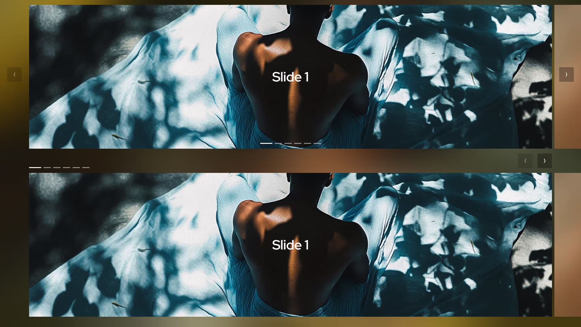
<carousel indicators controls>
    <div class="scroller">
       <div class="item"></div>
       <div class="item"></div>
       <div class="item"></div>
    </div>
</carousel>

<carousel indicators="top left" controls="top">
    <div class="scroller">
       <div class="item"></div>
       <div class="item"></div>
       <div class="item"></div>
    </div>
</carousel>

<script type="module">
    // Polyfill for Safari and Firefox
    if (!CSS.supports('scroll-marker-group', 'after')) {
        import("polyfill.js");
    }

    // Optional drag scroll
    const hasPointerFine = window.matchMedia("(pointer: fine)").matches;
    if (hasPointerFine) {
        import("drag_scroll.js");
    }
</script>
2. Polyfill
/* Polyfill for Safari and Firefox */
carousel, .carousel {
    &[indicators] {
        .scroll-marker-group {
            display: flex;
            min-height: calc(var(--indicator-height, .2rem) + 2rem);
            max-width: calc(100% - var(--edge-offset-x, 0) * 2);
            overflow-x: auto;
            scrollbar-width: none;
            gap: 1rem;
            display: flex;
            gap: var(--indicator-gap, .5rem);
            margin-inline: var(--edge-offset-x, 0);
            justify-content: center;
            pointer-events: none;
        }

        &:not([indicators~=top], [indicators~=bottom]) {
            .scroll-marker-group {
                position: absolute;
                inset: auto 0 0;
            }
        }

        &[indicators~=top] {
            .scroll-marker-group {
                grid-column: 1 / 2;
                grid-row: 1 / 2;
                align-self: end;
                margin-bottom: -1rem;
            }
        }

        &[indicators~=bottom] {
            .scroll-marker-group {
                grid-column: 1 / 2;
                grid-row: 2 / 3;
                margin-top: -1rem;
            }
        }

        &[indicators~=right] {
            .scroll-marker-group {
                justify-content: end;
            }
        }

        &[indicators~=left] {
            .scroll-marker-group {
                justify-content: start;
            }
        }

        .scroll-marker {
            padding: 0;
            height: var(--indicator-height, .2rem);
            width: var(--indicator-width, 1.5rem);
            box-sizing: content-box !important;
            border-block: 1rem solid transparent;
            border-inline: 0;
            border-radius: 0;
            pointer-events: auto;
            flex-shrink: 0;
            opacity: .5;
            background: var(--indicator-bg);
            background-clip: padding-box;
            transition: .3s;
            cursor: pointer;
        }

        .scroll-marker.active {
            width: var(--indicator-active-width, 2.5rem);
            opacity: 1;
        }
    }

    &[controls] {
        .scroll-button {
            display: grid;
            place-content: center;
            height: var(--button-size);
            width: var(--button-size);
            font-size: 1rem;
            border: 0;
            border-radius: 0;
            background: var(--button-bg);
            color: var(--button-color);
            cursor: pointer;
            z-index: 2;
        }

        .scroll-button:disabled {
            cursor: not-allowed;
            opacity: .5;
        }

        .scroll-button.left {
            &::before {
                content: "⟨"/ "Previous";
            }
        }

        .scroll-button.right {
            &::before {
                content: "⟩"/ "Next";
            }
        }

        &:not([controls~=top], [controls~=bottom]) {
            .scroll-button {
                position: absolute;
                top: 50%;
                translate: 0 -50%;
            }

            .scroll-button.left {
                left: max(calc(var(--edge-offset-x) / 4), var(--offset, .5rem));
            }

            .scroll-button.right {
                right: max(calc(var(--edge-offset-x) / 4), var(--offset, .5rem));
            }
        }

        &[controls~=top], &[controls~=bottom] {
            .scroll-button {
                grid-column: 1 / 2;
                margin-inline: var(--edge-offset-x);
                justify-self: end;
            }

            .scroll-button.left {
                translate: calc(-100% - var(--button-gap, 0)) 0;
            }

            &[controls~=left] {
                .scroll-button {
                    justify-self: start;
                }

                .scroll-button.left {
                    translate: 0 0;
                }

                .scroll-button.right {
                    translate: calc(100% + var(--button-gap, 0)) 0;
                }
            }

            &[controls~=center] {
                .scroll-button {
                    justify-self: center;
                }

                .scroll-button.left {
                    translate: calc(-50% - (var(--button-gap, 0) / 2)) 0;
                }

                .scroll-button.right {
                    translate: calc(50% + (var(--button-gap, 0) / 2)) 0;
                }
            }
        }

        &[controls~=top] {
            .scroll-button {
                grid-row: 1 / 2;
                align-self: end;
            }
        }

        &[controls~=bottom] {
            .scroll-button {
                grid-row: 2 / 3;
            }
        }

        &[indicators~=top][controls~=bottom] {
            .scroll-button {
                grid-row: 3 / 4;
            }
        }

        &[indicators~=bottom][controls~=top] {
            .scroll-marker-group {
                grid-row: 3 / 4;
            }
        }
    }
}
3. Polyfill JS
/* Polyfill for Safari and Firefox */
class CarouselPolyfill {
    /**
     * @param {string} [selector='carousel, .carousel']
     */
    constructor(selector = 'carousel, .carousel') {
        // Each entry: { carousel, scroller, items, markers, btnLeft, btnRight, scrollTimeout }
        this._carousels = Array.from(document.querySelectorAll(selector)).map(carousel => ({
            carousel,
            scroller: carousel.querySelector('.scroller'),
            items: Array.from(carousel.querySelectorAll('.scroller .item')),
            markers: [],
            btnLeft: null,
            btnRight: null,
            scrollTimeout: null,
        }));

        this._init();
    }

    _init() {
        this._carousels.forEach(state => {
            if (state.carousel.hasAttribute('indicators')) this._buildIndicators(state);
            if (state.carousel.hasAttribute('controls'))    this._buildButtons(state);
            this._bindScroll(state);
            this._update(state);
        });
    }

    // ── Indicators ────────────────────────────────────────────────────────────

    _buildIndicators(state) {
        const group = document.createElement('div');
        group.className = 'scroll-marker-group';

        state.items.forEach((_, i) => {
            const marker = document.createElement('button');
            marker.className = 'scroll-marker';
            marker.setAttribute('aria-label', `Go to slide ${i + 1}`);
            marker.addEventListener('click', () => this._scrollToIndex(state, i));
            group.appendChild(marker);
            state.markers.push(marker);
        });

        state.carousel.appendChild(group);
    }

    // ── Buttons ───────────────────────────────────────────────────────────────

    _buildButtons(state) {
        const btnLeft = document.createElement('button');
        btnLeft.className = 'scroll-button left';
        btnLeft.setAttribute('aria-label', 'Previous');

        const btnRight = document.createElement('button');
        btnRight.className = 'scroll-button right';
        btnRight.setAttribute('aria-label', 'Next');

        btnLeft.addEventListener('click',  () => this._step(state, -1));
        btnRight.addEventListener('click', () => this._step(state,  1));

        state.carousel.appendChild(btnLeft);
        state.carousel.appendChild(btnRight);

        state.btnLeft  = btnLeft;
        state.btnRight = btnRight;
    }

    // ── Scroll helpers ────────────────────────────────────────────────────────

    _scrollToIndex(state, index) {
        const item = state.items[index];
        if (!item) return;

        const scrollerRect = state.scroller.getBoundingClientRect();
        const itemRect     = item.getBoundingClientRect();

        const targetScrollLeft =
            state.scroller.scrollLeft +
            (itemRect.left - scrollerRect.left) -
            (scrollerRect.width - itemRect.width) / 2;

        state.scroller.scrollTo({ left: targetScrollLeft, behavior: 'smooth' });
    }

    _step(state, direction) {
        const current = this._currentIndex(state);
        const next    = Math.max(0, Math.min(state.items.length - 1, current + direction));
        this._scrollToIndex(state, next);
    }

    _currentIndex(state) {
        const scrollerRect   = state.scroller.getBoundingClientRect();
        const scrollerCentre = scrollerRect.left + scrollerRect.width / 2;

        let bestIndex = 0;
        let bestDist  = Infinity;

        state.items.forEach((item, i) => {
            const rect       = item.getBoundingClientRect();
            const itemCentre = rect.left + rect.width / 2;
            const dist       = Math.abs(scrollerCentre - itemCentre);
            if (dist < bestDist) { bestDist = dist; bestIndex = i; }
        });

        return bestIndex;
    }

    // ── State sync ────────────────────────────────────────────────────────────

    _update(state) {
        const index = this._currentIndex(state);

        state.markers.forEach((m, i) => m.classList.toggle('active', i === index));

        if (state.btnLeft)  state.btnLeft.disabled  = index === 0;
        if (state.btnRight) state.btnRight.disabled = index === state.items.length - 1;
    }

    _bindScroll(state) {
        state.scroller.addEventListener('scroll', () => {
            clearTimeout(state.scrollTimeout);
            state.scrollTimeout = setTimeout(() => this._update(state), 50);
        }, { passive: true });
    }
}

// ── Bootstrap ─────────────────────────────────────────────────────────────────
new CarouselPolyfill();
Integration
For desktop users, you can include the optional drag scroll utility to enable intuitive mouse-drag interactions on the scroller.
- Include Styles: Add the
carousel.cssto your project to define the layout and visual state of the component. - Define Markup: Wrap your content items in a
<carousel>tag with a.scrollercontainer and.itemchildren. Use attributes likeindicatorsorcontrolsto enable UI elements. - Load Polyfill: Add the conditional script block to detect CSS support and load the
polyfill.jsonly when necessary for Safari, Firefox, or older Chromium versions. - Desktop Drag Support: Optionally import
drag_scroll.jsusing a(pointer: fine)media query to allow mouse dragging on desktop browsers.