Accordion
A high-performance, layout-aware accordion system leveraging modern CSS pseudo-elements for seamless state transitions without JavaScript dependency.
Overview
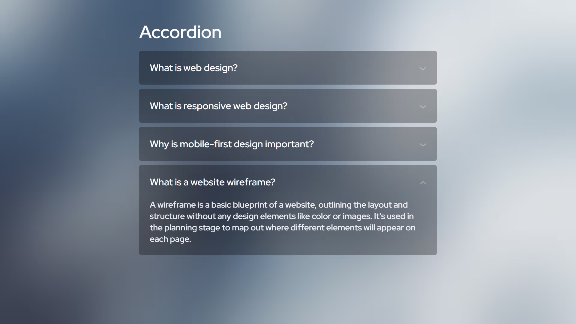
The Progressive Accordion Engine is a refined implementation of the native <details> and <summary> elements. It utilizes the cutting-edge ::details-content pseudo-element and the calc-size() function to solve the historical challenge of animating elements with an auto height. This approach ensures a fluid, GPU-accelerated user experience while maintaining a strict "Vanilla" architecture and zero-bloat logic.
Key Features
- Zero-JS Animation: Achievement of smooth height transitions using native CSS interpolation rather than heavy JavaScript calculations.
- Native Accessibility: Built on semantic HTML5 structures, providing out-of-the-box keyboard navigation and ARIA compliance.
- Exclusive Expansion: Supports the native
nameattribute to allow for "exclusive" accordion behavior where only one panel remains open at a time. - Geometric Precision: Designed with the FWS 0-radius protocol, ensuring mathematical order and visual consistency.
Technical Specifications
| Parameter | Value |
|---|---|
| Logic | Native HTML5 |
| Styling | Modern Vanilla CSS |
| APIs | Details/Summary API |
| Payload | < 1KB (CSS) |
Implementation
1. Structural CSS
/* Core accordion container logic */
[accordion] {
    --padding: 1.25rem;
    --transition: .3s;
    --background: var(--surface-color, #F0F0F0);
    background: var(--background);
    border-radius: var(--radius);

    /* Focus state for keyboard accessibility */
    &:has(summary:focus-visible) {
        outline: 2px solid;
    }

    /* Interactive summary header */
    summary {
        display: flex;
        justify-content: space-between;
        align-items: start;
        gap: 1rem;
        padding: var(--padding);
        cursor: pointer;

        /* Custom geometric indicator */
        &::after {
            content: '>';
            font-size: 1rem;
            rotate: 90deg;
            scale: 1 1.5;
            translate: -15% 15%;
            transition: rotate var(--transition);
            opacity: .3;
        }

        /* Open state indicator transformation */
        [open] & {
            &::after {
                rotate: 270deg;
            }
        }

        &:focus {
            outline: none;
        }
    }

    /* Modern animation logic for content expansion */
    &::details-content {
        content-visibility: visible;
        padding-inline: var(--padding);
        height: 0px;
        transition: height var(--transition);
        overflow: clip;
    }

    /* Animated height calculation */
    &[open]::details-content {
        height: calc-size(auto, size + var(--padding));

        /* Fallback for older browsers */
        @supports not (interpolate-size: allow-keywords) {
            height: auto;
            padding-bottom: var(--padding);
        }
    }
}
2. Structure
<!-- Multiple panels can be open simultaneously -->
<details accordion>
    <summary>Architecture Overview</summary>
    <p>Pure vanilla standards ensuring maximum performance and longevity.</p>
</details>

<details accordion>
    <summary>Design Protocol</summary>
    <p>Mathematical order through 0-radius geometric precision.</p>
</details>

<!-- Exclusive expansion: only one panel can be open -->
<details accordion name="system-docs">
    <summary>Core Logic</summary>
    <p>Raw ES6+ implementation with zero external dependencies.</p>
</details>

<details accordion name="system-docs">
    <summary>Performance Audit</summary>
    <p>Optimized for 100/100 Lighthouse performance scores.</p>
</details>
Integration
- Inject Styles: Copy the structural CSS into your global stylesheet or a dedicated component module.
- Define Markup: Use the
<details accordion>structure in your HTML, optionally adding thenameattribute for exclusive behavior. - Verify: Ensure the browser supports
calc-size()for the smoothest experience, or verify the fallback logic in legacy environments.